In November I published Absent Souls as an ebook only. This wasn’t because I didn’t have a paperback ready but because I’d planned to have new covers for my books and it made no sense spending extra money on a paperback cover which would only be replaced in a few weeks. Or so I thought.
The need for change
When I first published Second Chance, I couldn’t afford to have a bespoke cover designed and I have the drawing skills of a three-year-old, so I used a pre-made cover service at goonwrite.com. I went on the site, chose a cover I liked, had my book title and author name added and published. If you are looking to publish on a budget, I would thoroughly recommend this approach.
After a couple of weeks I’d sold enough ebook copies to justify buying a paperback cover. It was more expensive, but many people had contacted me asking for a paperback so i knew it would eventually pay itself back.
While I love the cover for Second Chance, I realised quite early on that the combination of title and cover art wasn’t eye-catching enough to attract a reader’s attention, or to convey what the book was about. However, I needed to sell enough copies to justify the expenditure.
The bad
Nine months later and I was in a position to move. I’d done my research, identified a well-respected cover designer who was very busy but was taking on commissions from mid-December. I paid my 50% deposit, was sent a briefing document, completed it and was told it would be 10 working days before I received my first designs, so I happily waited.
And waited.
And waited.
I chased a couple of times, received apologies and the offer of a discount for my trouble, then six weeks after the work started, I received the first designs. They were good, not exactly what I wanted but they showed promise. I sent my feedback as requested and waited.
And waited.
And waited.
I chased on numerous occasions but received no reply. Eventually I was forced to contact Paypal to get my money back, which the designer did quickly and with no complaint. I still have no idea what went wrong.
The good
It was now three months since the process had started, four months since Absent Souls was published and I was still no closer to having the new covers I needed. I started to research online once again and saw this post by Julie Stock, raving about the cover for her new book, From Here to Nashville. I looked up the site of her designers, Design for Writers, and liked what I saw. I contacted them and as luck would have it they were able to slot me in for mid-April.
I was clearly nervous after my last experience but I was soon put at my ease. the briefing process was so much more refined. I was asked questions about the book, the story, the lead characters, but also about how the book makes readers feel, the atmosphere it creates, the type of book covers I like and why, and those I don’t, along with many, many more. Where my answers weren’t clear, Andrew – the designer – asked pertinent questions to help me think about what I was looking for.
The team at Design for Writers use basecamp to manage their projects, so I had access to anything that was said at any time and knew exactly what was going on. There was interaction, and lots of it, and best of all Andrew positively encouraged ideas, but was also not afraid to say when things wouldn’t work and why. I told them to design the covers I need, not necessarily what I wanted. Thankfully they delivered on both counts. If you are ever looking for cover designers, I couldn’t recommend Design for Writers enough.
The beautiful
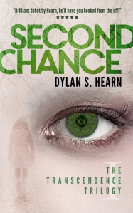
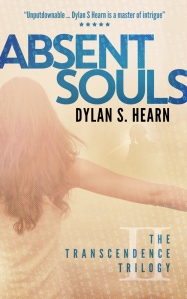
So here is the end result. These are my beautiful new covers. For those of you who’ve read my books, hopefully what you see will correspond with what you’ve read (although please don’t give away any details).
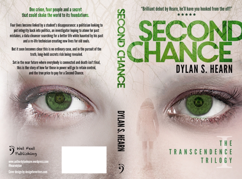
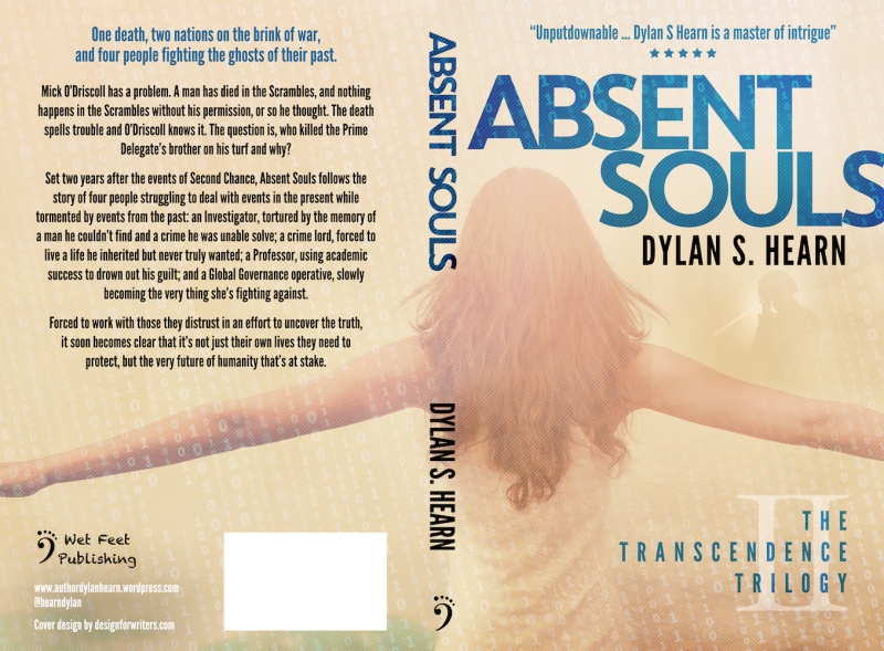
The paperbacks for Second Chance and Absent Souls have been updated and are now available to purchase, the ebooks are in process of having their selling pages updated in the next day or so. I’ve also included the full paperback spreads below as I think they’re truly stunning.
So what do you think? Do you like my covers? If you’re a writer, how did you go about getting your covers designed? Was it a bad, good or beautiful experience? I’d love to hear from you.
Do you like intelligent thrillers? If so, join my mailing list and get one of my 5-star rated near-future dystopian thrillers absolutely free. The mailing list is guaranteed spam free and I will only contact you if I have a new book launch or an exclusive short story to share. To sign up, please click here.


wow these covers are really professional and beautiful!!! I’ve been looking up different companies to do my covers, and I found one that i really like, but after reading this and seeing your covers, I think I’ll definitely look into design for writers and consider my options!!! Thank you so much for this post, it was extremely informative!:)
You’re more than welcome and I’m glad you liked them. Design for Writers are just excellent. What I liked most about them when looking is that they produced many different styles of cover for many different types of books yet they were all really good quality. You won’t be disappointed.
wow thats incredible!:) by the way, i checked your book up on amazon and it looks real good! im definitely adding it to my list of books ill be buying soon!!!:) congrats on publishing the book!!:)
Thank you. I hope you enjoy the book and good luck with your own 🙂
thanksss!!:)
Hi Dylan,
Thanks for the pingback and for the mention. I’m so glad to hear that you went to Design for Writers on my recommendation and that you’re so pleased with your new covers. I think they look great too. I can’t begin to tell you how many people have commented on my wonderful cover and every time I see it on social media, I glow with pride at just how great it is! I loved it so much I submitted it to Joel Friedlander’s Ebook Cover Design Awards here: ‘http://www.thebookdesigner.com/2011/08/monthly-e-book-cover-design-awards/’ and it won a gold star. Good luck with your new covers. I hope they lead to lots of sales 🙂
You’re more than welcome. Thanks for the suggestion and congratulations on the prize! I hope all is going well for you.
The covers look great, Dylan!
Thanks, Carrie!
Hi Dylan. Thanks so much for your lovely comments about our work together. What authors often fail to realise is that so much of a successful book cover design is about you guys – the authors – not us. You have the answers, but often just aren’t aware of it. We get to go hunting with you to make sure that we find the right answers together! And when I work with people like yourself and Julie (who’s recommendation you followed) who are fully engaged in the process…well, it’s just a joy 🙂
The book cover should be a fun part for you but it’s also disproportionately important because so many people do make a judgement. I’m guilty of it myself when I wander into a bookstore…though to be fair I often spend more time examining covers than the books within 😉
We are of course open to new clients and always looking for interesting authors and fun projects to work on. But whoever anyone chooses to design their cover please remember: make sure to brief your designer well and collaborate with them. That way lies the best results every single time!
Thanks again for the very kind post, Dylan 🙂
You’re more than welcome and I couldn’t echo your points more. I loved working with you and the journey we went through to get the covers where we are today. Writing, for the most part, is a solitary exercise. There is interaction when working with editors and beta readers, but unless we’re collaborating with another writer we rarely get to create with somebody in the way we did when creating these covers, so I loved every minute and I can’t wait to go through the whole process again when Genesis Redux is ready.
Another cool title!
You’re good at this 😉
It has to be two words. Any more than that and I just get confused 😉
I know this is a very real possibility for me in the future (if I can ever finish this draft) so thank you for the insight! It’s great to hear what happened to other writers as they worked through the issues publishing. Thanks for your insight!
You’re more than welcome, and good luck on your journey!
Um. First question though, did you ask your editor for his view? It’s amazing how many authors don’t, but the one person who knows the book as well as you do is your ed. I was reviewing a book a while back and the detail on the cover did not accurately reflect the book, to the point of actual visual errors.
Secondly, I thought the first set of your covers were bland, but okayish within a bland spectrum. I didn’t dislike them.
However, having read both books a couple of times, and fairly intensively, I don’t like the new covers. There. I said it. I hate being the first, or only one, but to me they don’t capture the books at all.
Someone asked me about a proposed book cover recently, and after everyone else said yeah it was great, the author took my comment and someone else’s into consideration and changed it. Another author changed their cover after posting previews on their blog.
So, as well as asking if you involved your author, did you ask your betas, or whoever knows your novel well? Or really, anyone who onows graphic design? because you should treat your covers the same way you treat your text. Go professional but ask around. At one point when I was working in PR, we paid for half a dozen mock up designs and asked for opinions on all of them.
If you’re happy, and you are, no worries. Just a different pov.
Thank you for your honesty.
I did speak to my editor who also liked the covers. I think with books like mine with a number of plot strands, there are always parts some readers identify with more than others and their view of the book and what it’s about becomes shaped by that.
I’m really pleased with the covers (as you can probably tell) but I appreciate that not everyone will feel the same.
Great covers! I love the carry over from front cover to back cover. I wrote about two different book cover designs on my blog. Check them out:
https://theindependentauthor.wordpress.com/2014/08/15/book-cover-design-99-design/
https://theindependentauthor.wordpress.com/2015/02/06/book-cover-design-octagonlab/
Thank you and thanks for sharing your journey.
Well, like Kate I’ve read both books and unlike Kate I can say I do like them, especially Second Chance. Certainly the wrap layout has given me some thinking for my second book; always good to be stimulated. Let’s hope it triggers a rush of sales!
Thank you. I’m glad you like them too. I really love the wrap concept too and was delighted when the designer came up with it.
I like the covers. They look professional and capture an ethereal, other-wordly, sci-fi vibe.
Thanks, Karen 🙂
Hi. I’ve just used Design for Writers for my cover too and was also really happy. I’m planning a blog post about the process as well. Like you, I really like the way they work and how they seemed to get into my head.
They really are very good. My only worry is that word will get out and they’ll become so busy they won’t have time to do my next cover!
Ha! Book them now 😉
Nice new covers, but I also liked the original ones. Maybe they gave out too much of a space-vibe but the colors were nice and I like abstract pictures. I think these new ones need a closer look to bring out the sci-fi aspect. If I only saw the thumbnails, I would guess they were some paranormal/ghost/romance thriller/etc. but in the bigger picture it’s clearer the green eyes are tech-y and there are 0s and 1s in Absent Souls. Great work still, I’ll keep Design for Writers in mind for later.
For my book, Awoken Dragon, I designed and did the cover myself, and I quite like it. I’ve been thinking about releasing new covers or a ‘boxed’ edition with a special cover when all three books are out. But we’ll see.
Thank you. I liked the old covers too (hey, I chose them) but I didn’t feel they were doing their job of catching the eye of a reader. I guess I’ll find out soon enough if I’m wrong 🙂
Very eye catching distinctive designs. I’ve lost count how many times I’ve changed my book covers, but I think I’m settled now though. I do them myself and I’m never satisfied.
Chris
I wish I had the artistic talent to create my own covers but I’m such a terrible artist. Think about the worst adult-drawn art you’ve seen and then go down from there. That’s me.
Thanks for the post. I’ll definitely check these guys out when the time comes.
I can’t recommend them enough!
Beautiful covers Dylan 😀
Thank you 🙂
These are very eye-catching and I like the contemporary feel, particularly the way the titles ‘bleed’ over the edge. You’re wise to go with wraparound too (that’s the only thing about my own cover that I would change) – I’ve noticed that sometimes the spines don’t print in exactly the right place, and with a wraparound, this won’t matter and won’t affect the quality of production. When I looked at Createspace’s guidelines I noticed they recommend wraparound… but too late! I’d wondered where your new covers were, and I’m thrilled you have them at last. They are certain to give a stronger impression and I hope you see a boost in sales as a result. I can’t wait to see what the third cover will look like now! Nicely done, Dylan 🙂
Thank you, Julie. The titles bleeding over was interesting. I love the look but unfortunately Createspace don’t accept ‘active’ elements (titles, subtitles etc) to be within a small margin of the edge of the design – apparently it causes production issues because it looks like a fault – so we had to alter the paperback cover to pull the titles back. It was quite annoying at the time! Luckily Design for Writers were happy to alter the cover at no extra cost. I’ve kept the ebook covers with the cut-off, though.
We live and learn with these things. One of the designs I favoured for Singled Out would have fallen foul of the same thing. I imagine it’s for the same reason that they encourage authors towards wraparound covers, with no hard edges at the spine. The quality of CreateSpace production is excellent but I guess there has to be some tolerance for error. Still… You have your fabulous new covers now, a fresh look and feel to energise your sales, and I will ‘need’ to acquire the matching pair! Next step… That third cover. Then what about the ‘box’ part of the box-set!
Give me a chance. I’m going as fast as I can! 🙂
I like them, particularly Second Chance. They suit the books well.
I really like them too, Dylan. They look snazzy, modern and professional. Not to mention genre-suitable. I don’t think you need anything else in a cover.
Thanks, Tara!
Much better. Like you, Dylan, I could see that the covers didn’t stand out enough to attract attention. The new ones not only stand out more but they are in a style that connects the two books more obviously than the previous covers.
I was very fortunate in finding a designer who also wanted to make it a collaborative effort. She was also willing to take the time to tweak it and get it right with me, recognising not only the need to get the cover right for that book, but to get the brand right for any future books. We spent an inordinate amount of time playing with fonts and colours before settling on how my name should appear on the cover!
What was even more fortunate was that she was really just starting out at the time, so did the job for a ridiculously low cost. Even her current prices seem more than reasonable (in spite of almost tripling them). So I’ll be sticking with Torrie for now, but it’s good to know about these guys if she falls by the wayside for any reason.
Thanks you, Graeme. I, too, was very particular about everything to do with the design, but Design for Writers were incredibly patient, only pushing back if they felt any suggestion I had would be detrimental to the overall goal of having a cover that was eye-catching and met the brief. I can’t recommend them highly enough.
The covers look great!
Covers have always been a bane of my existence. Never had money to buy them, not much talent in making them. I finally plopped down money for my popular stories and bought covers for them and the others I just use Amazon’s Cover Creator (thankfully they have that option now).
Thank you. I think that if I ever tried to use a cover creator programme, my covers would end up here http://kindlecoverdisasters.tumblr.com
Reblogged this on theowlladyblog.
These covers are stunning, Dylan! So glad it worked out for you in the end. 🙂
Thanks, Sue. I’m glad you like them as much as I do 🙂
Reblogged this on Archer's Aim and commented:
Reblogging on Archer’s Aim – Follow-up on cover art from earlier this week.
I think the covers are stunning. Glad you pushed forward. 🙂
Your new covers look very polished and professional. I especially like the one for Second Chance.
I recently had new cover ART done for three of my twin’s science fiction novels. Aside from the “eep!” of spending money for that (although less than expected), it was a good experience, and rather exciting. The artist, Jereme Peabody, was professional, very fast, and easy to work with. As for cover DESIGN, we already had that taken care of, because my twin is very good at such things, so all he needed to do was switch the old art out for the new and adjust the colors of background and text to go with the colors in the new art.